Dominator Suspension

Package Redesign

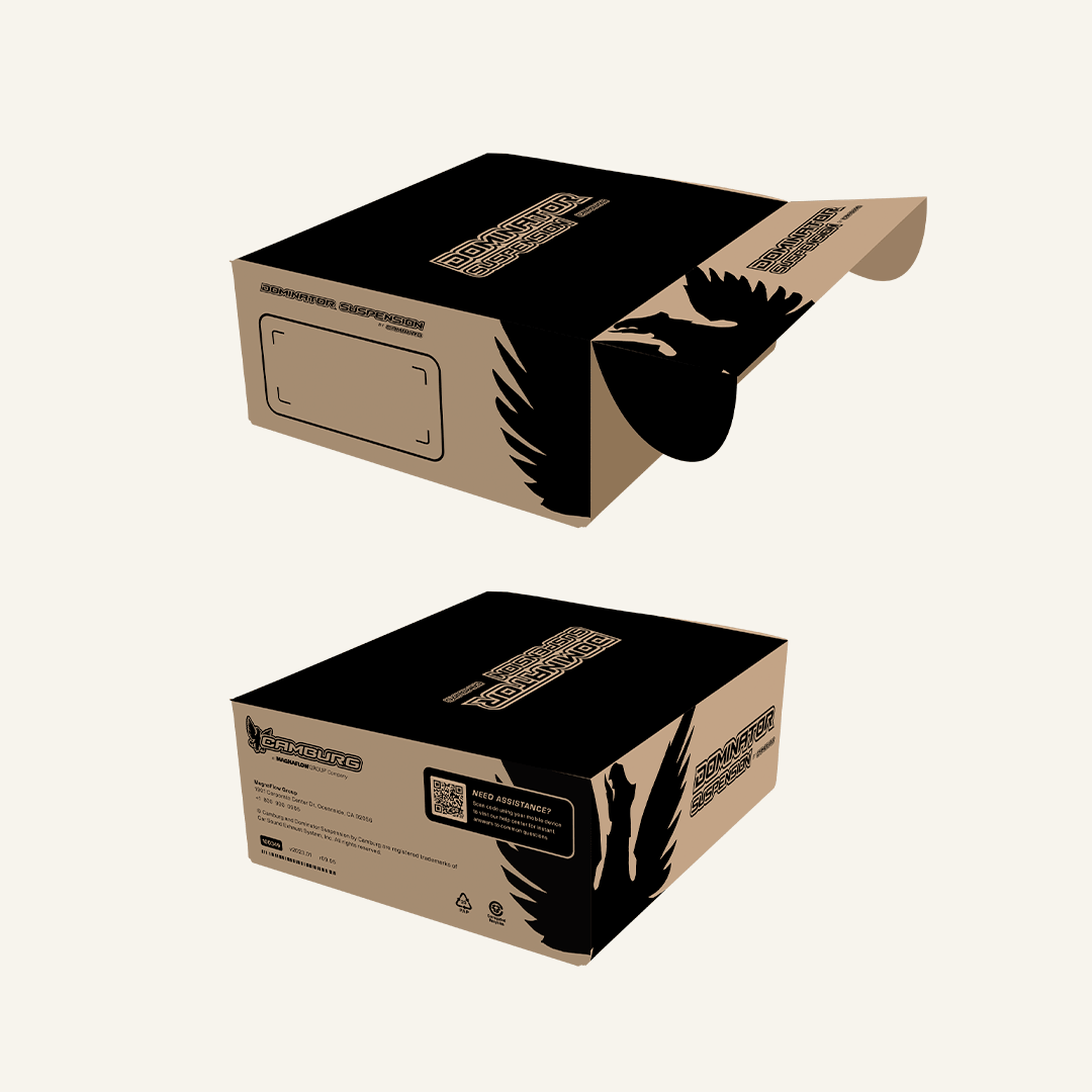
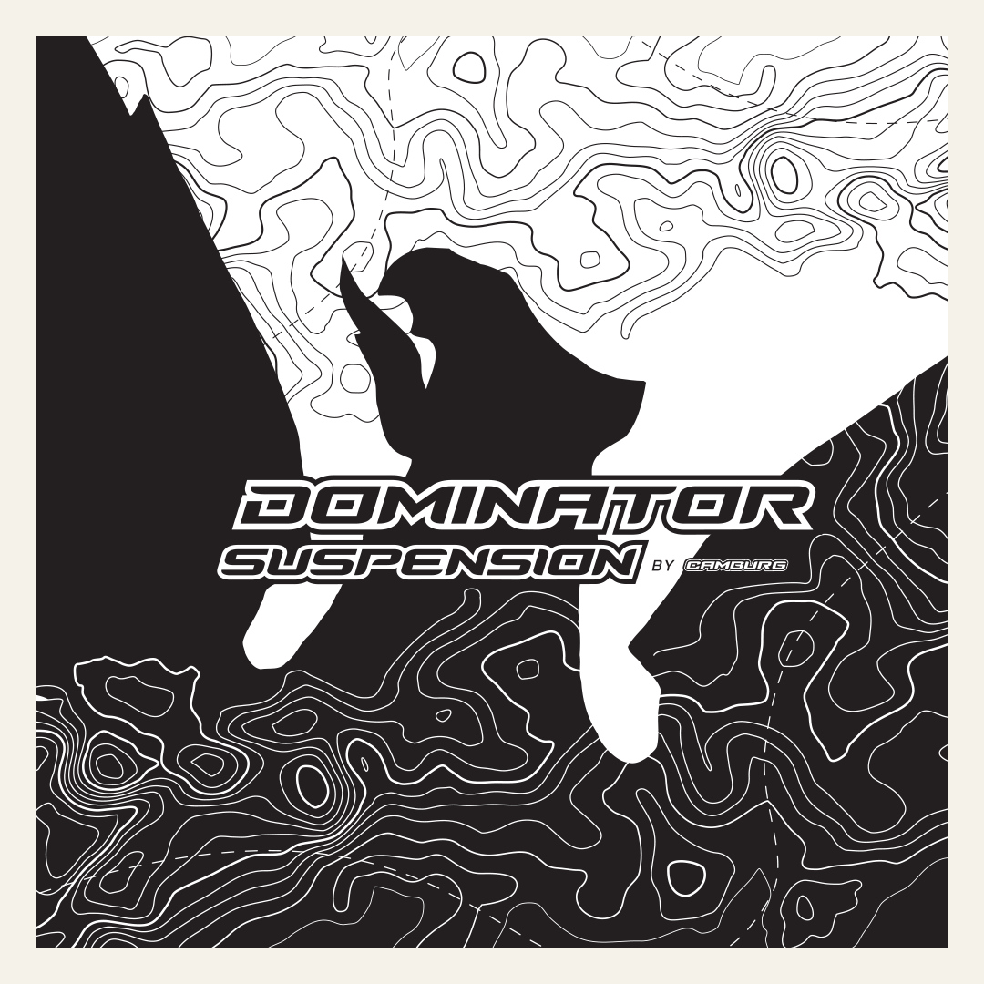
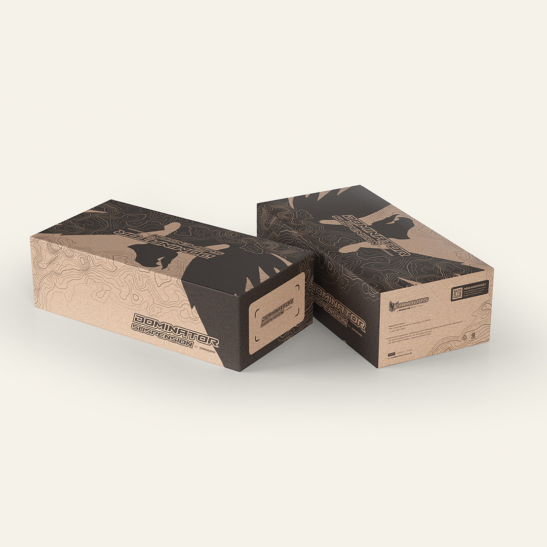
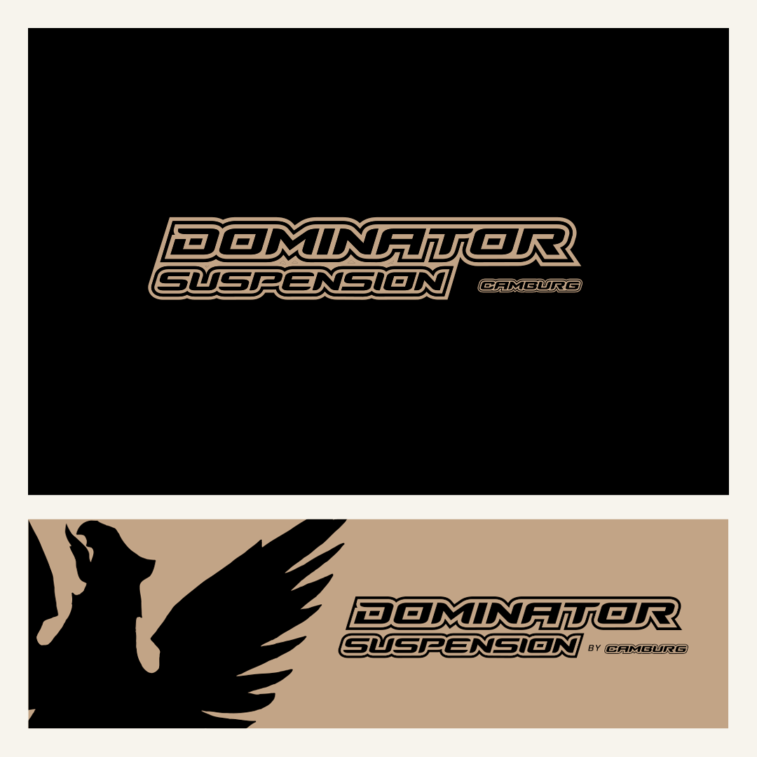
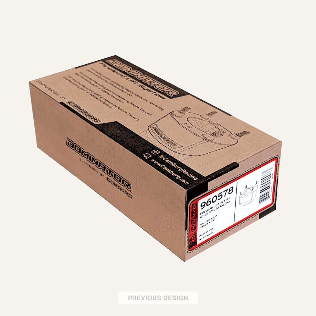
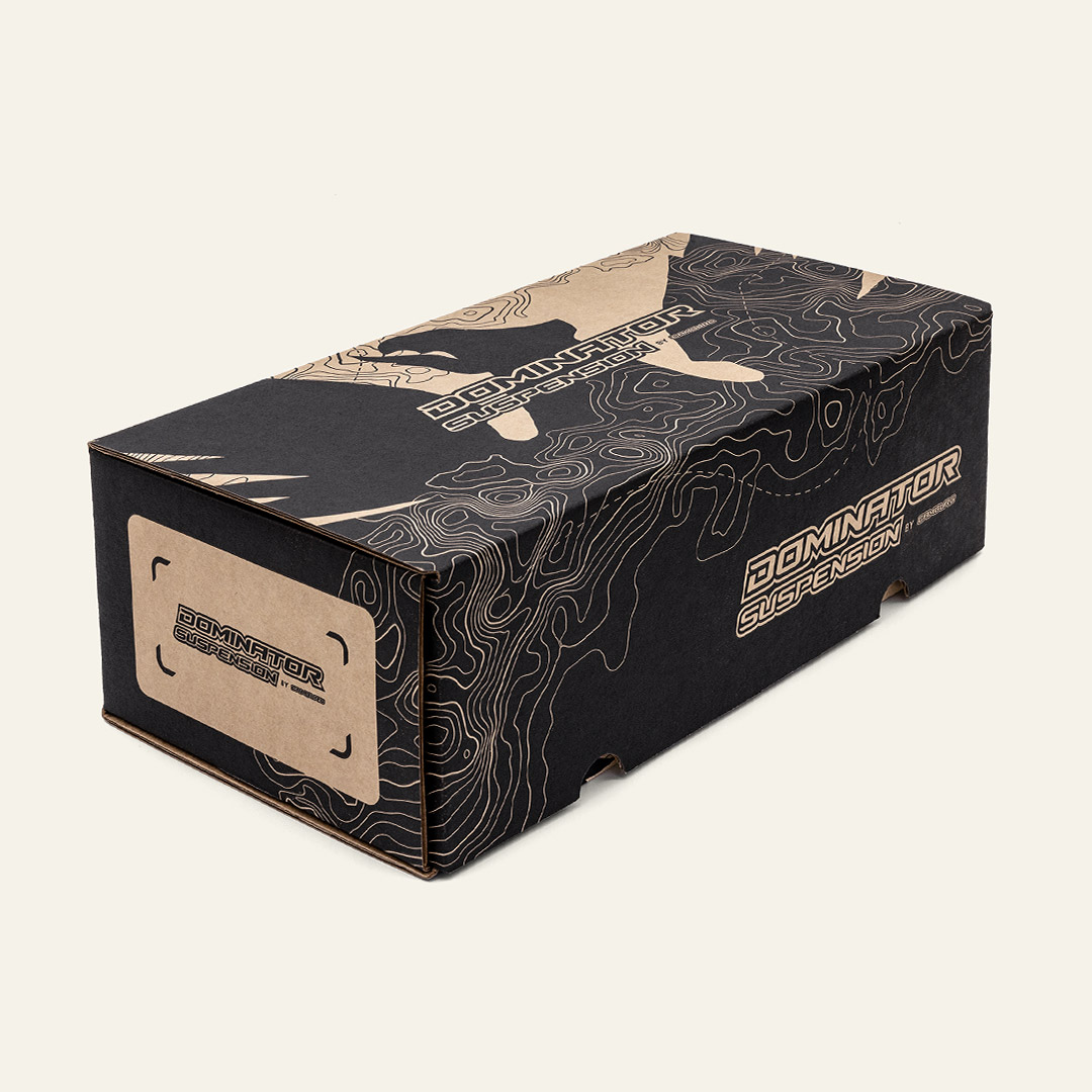
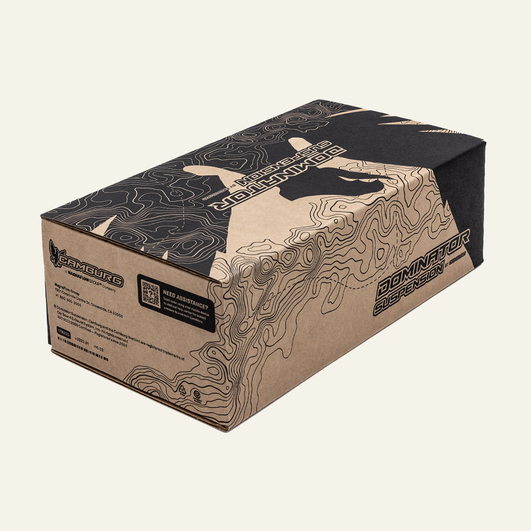
When Camburg introduced Dominator Suspension, the goal was to create a more accessible, budget-friendly alternative to its premium suspension line. The challenge was to differentiate the new product tier without diluting Camburg’s reputation for engineering quality and off road performance.

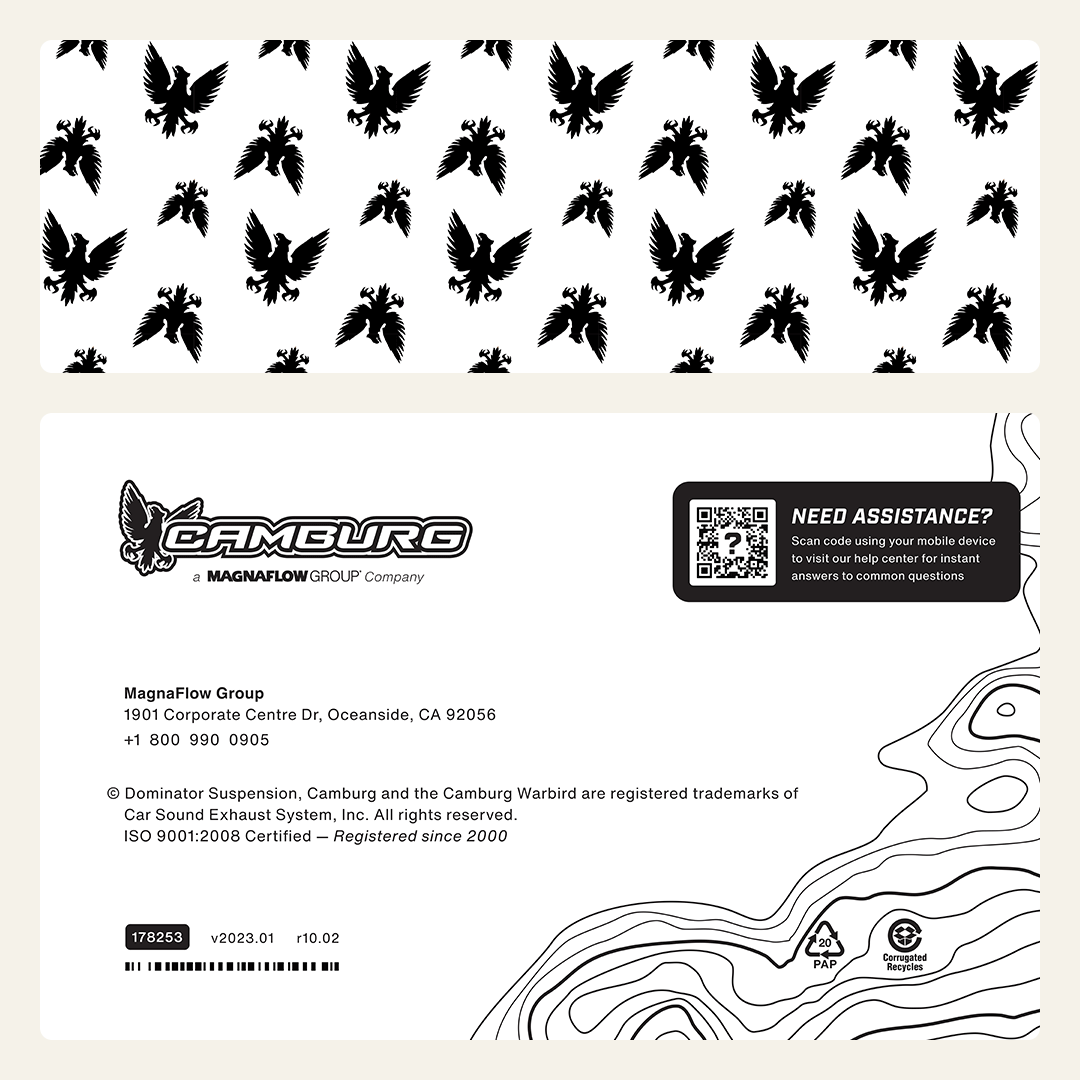
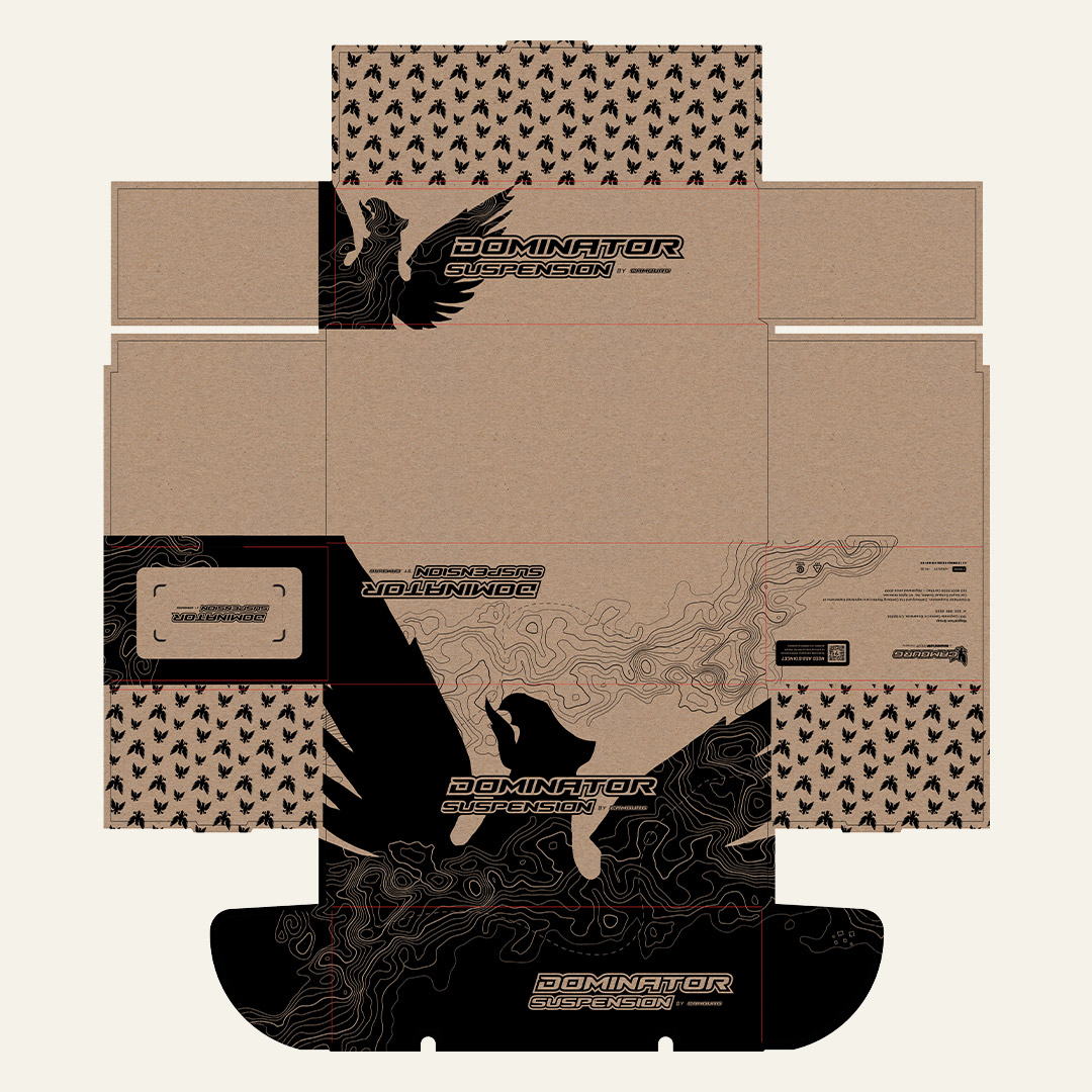
I led the art direction and design development for the packaging, defining how Dominator would visually live within the Camburg ecosystem while clearly signaling a different price point. Stakeholder feedback was incorporated throughout the process, but the visual strategy and execution were driven internally.

STAKEHOLDER
Jerry Zaiden

ART DIRECTION/DESIGN
Arturo Torres

Defining the Visual Strategy

The primary objective was impact without excess. The packaging needed to stand out at retail while remaining cost-effective to produce.

Rather than rely on heavy graphics or multiple print passes, I developed a one-color system built on contrast, hierarchy, and structure. The approach emphasized clarity and strength over decoration, allowing the product name and core brand assets to carry the weight.

To maintain continuity with the parent brand, I integrated the Camburg Warbird icon as a recognizable anchor. A subtle topographic pattern was introduced to evoke terrain and exploration, reinforcing performance cues without adding visual noise.

Designing for Scalability and Cost

Typography was bold, industrial, and structured to communicate durability. The layout prioritized negative space and disciplined alignment, ensuring the design felt intentional and confident.

Every decision considered manufacturing efficiency. The one-color execution reduced production costs while remaining visually assertive on shelf. The system was designed to scale across SKUs without increasing complexity, creating a repeatable framework for future expansion.

The Outcome

The final package successfully positioned Dominator as a value-driven performance line while preserving Camburg’s premium perception. It delivered strong shelf presence through restraint, not excess.

More importantly, it established a clear visual hierarchy within the broader brand portfolio, demonstrating how thoughtful design leadership can differentiate product tiers while strengthening the overall system.